Life with the Dash button: good design for Amazon, bad for everyone else

By Mark Wilson
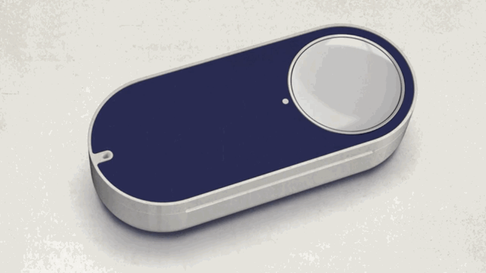
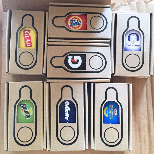
On a sunny Saturday morning, seven Amazon Dash buttons arrived to my apartment. Dash is a decidedly Jetsonian future come to life. A Wi-Fi connected button for my every need! Push one in my toddler's bedroom, and Huggies diapers would appear at my doorstep. Push another by my bathroom sink, and Gillette razors arrive to shave my beard away. With this $35 shipment, I'd be able to stick a Dash button in every room; I could order products like Glad trash bags right from my kitchen, or Kraft Easy Mac right at the dining room table.
But after actually living with Amazon's Dash buttons, I realized that they are just the latest symptom of Amazon's slowly spreading disease. The company is no longer designing their products and services with a customer experience that will woo us to be loyal, but for profit maximization now that we're here. The Dash button is an unabashed attempt to disconnect customers from the amount of money we're spending. And frankly, even that would be fine, if only Dash buttons provided the instant product gratification they promise.
The Core UI Doesn't Actually Make Sense
Buttons are satisfying to press because they make things happen. Just watch two kids under the age of 12 fight for the privilege of pushing the elevator. Things light up! Doors swing open! Dings sometimes happen!
Dash buttons are just the latest symptom of Amazon's slowly spreading disease.
Yet as I laid suffering from a deathly cold on my bed, looking on at the Gatorade Dash button I'd placed within arm's reach on my nightstand—originally placed there as a joke, as if a marathon bout of lovemaking could leave me in such dire need of electrolytes that I'd slam the button for emergency hydration—I began to internalize the cognitive dissonance at the core of the Dash button's design. I could press this button when I desperately wanted some sugary fluid to fight my cold, and I'd conveniently receive it . . . 48 hours from now. Would I want Gatorade in 48 hours? Would I still be sick, or still be alive to drink it in two days time?
Amazon has same day shipping on many products, and maybe if the Gatorade applied, I'd have actually pressed the button on that mucusy day. But the core gesture of pressing a button to receive gratification days later fundamentally feels less like convenience than illusion.

The Products Are Limited, And Generally Expensive
Of course, we're not always ordering products on our potential deathbeds. The Dash button advertises products like razors, laundry pods, and diapers. These are things you might see that you're running low on with a bit of notice. And when that happens, the button is waiting there at the bathroom sink or by the changing table to let you order more in perfect domestic context.
But Amazon severely limits what you can actually order. Not only are Dash buttons currently limited to a few brands—you can, for instance, acquire a button to buy Huggies but not Pampers, or Glad trash bags but not Hefty—when you actually set up each button for the first time, you learn that the sub-selections are further limited to a preselected list.

The Dash button makes you pay for its supposed convenience by removing potential discounts.
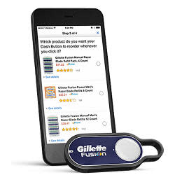
Take razors. I buy Mach3 razors. (Now you know.) Gillette's button wants to sell me Fusions, or, at the very least, Mach3 Turbo razors. If I buy my Mach3s through Amazon's actual website, not only can I spend less money on more razors, I can choose from seven pages worth of other Gillette razor options, full of different sized packs, disposables, bundles, clippable coupons, and more. Plus, on other items, the website allows me to see price per oz or per sheet. Amazon's Dash button interface leaves these money-saving details behind along with Add-on Items and Subscribe & Save.
The Dash button narrows your options to what, at best, will be the stock Amazon price on what you wanted, and at worst, lack applicable discounts, optimally priced configurations, or even the option to buy the product that you loyally purchase through Amazon already. Why doesn't Dash just offer the option to program a button with any product you want, or at least any product you want under a certain brand? The Dash button makes you pay for its supposed convenience by removing potential discounts. It's not enough that you're hanging advertisements in the nooks and crannies of your home. You need to cough up extra cash to use the Dash, too.

Amazon No Longer Designs For Us
Unfortunately, this extra bit of penny pinching defines many of Amazon's worst designs. Consider that their Fire Phone had a dedicated button to scan and buy more Amazon goods. We're talking about a tiny piece of industrial design where every sub-millimeter matters—one skinned with the Amazon brand so you never forget who sold it to you—and they had to take just a bit more of the hardware for themselves.
Or consider the frustrations of shopping for goods on Amazon today. The Prime options are disappearing for bulk "Pantry" boxes with large minimum orders and "Add-on Items" that require other purchases. Through their entire item taxonomy, Amazon's store UX is no longer designed for your convenient shopping, it's designed for their profitable selling.
This extra bit of penny pinching defines many of Amazon's worst designs.
When Amazon puts the customer first, they've designed some of the best experiences of the modern era—and on a Walmart rather than Apple budget. The Kindle, through wireless, DRM-streamlined book buying and an e-ink screen that sips on battery power, brought e-reading the the masses in an era when smartphones were still nascent. Their Prime stick, a tiny dongle which sells for as little as $20, brings a decent streaming media UI to any TV. Even Prime memberships: For a flat, understandable rate, customers could buy expedited shipping on unlimited orders a year. Each of these moves wasn't just good for shoppers; they benefited Amazon by adding another tether of customer loyalty in an era when we could all google ourselves a better deal. How deep do these loyalties go? Just consider that Apple released their iPad, the way most iPad users bought and read books wasn't through iBooks, but through Amazon's Kindle app.
But the Dash button isn't a great product because it's not made for you or me. It's designed by balance sheet and wishful corporate thinking to make some middle managers very happy. Life with a home full of Dash buttons only served to remind me how unhappy I was with the modern Amazon.
[All Photos (unless otherwise noted): via Amazon]

